Home
  • Contact
  • Work
  • Insights
  • About
  • Contact

London.

65 Leadenhall Street
London EC3A 2AD
View map
  • LinkedIn
  • Instagram
  • YouTube
  • Creative Pool

© 02.03.04 – Dusted Design Partners (trading as “Dusted” in the UK) is part of Dusted Group Limited. The Dusted name, Dusted logo and “D.” device are registered trademarks (in the UK) of Dusted Design Partners.

  • Privacy policy
  • Cookies policy
Accreditation
Home

Verbatim

From legacy to modern everyday essential.

Ambition to action.

services

BrandCampaign

sectors

ManufacturingTechnology

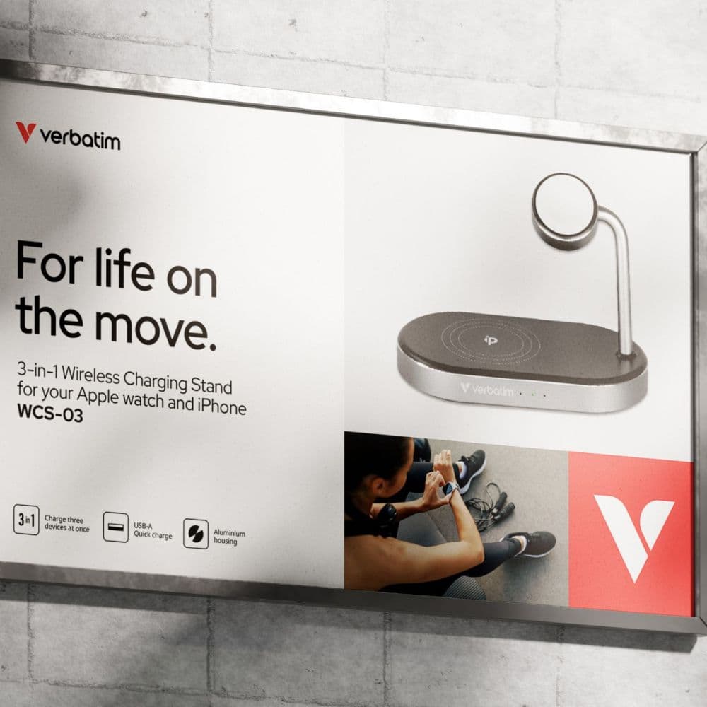
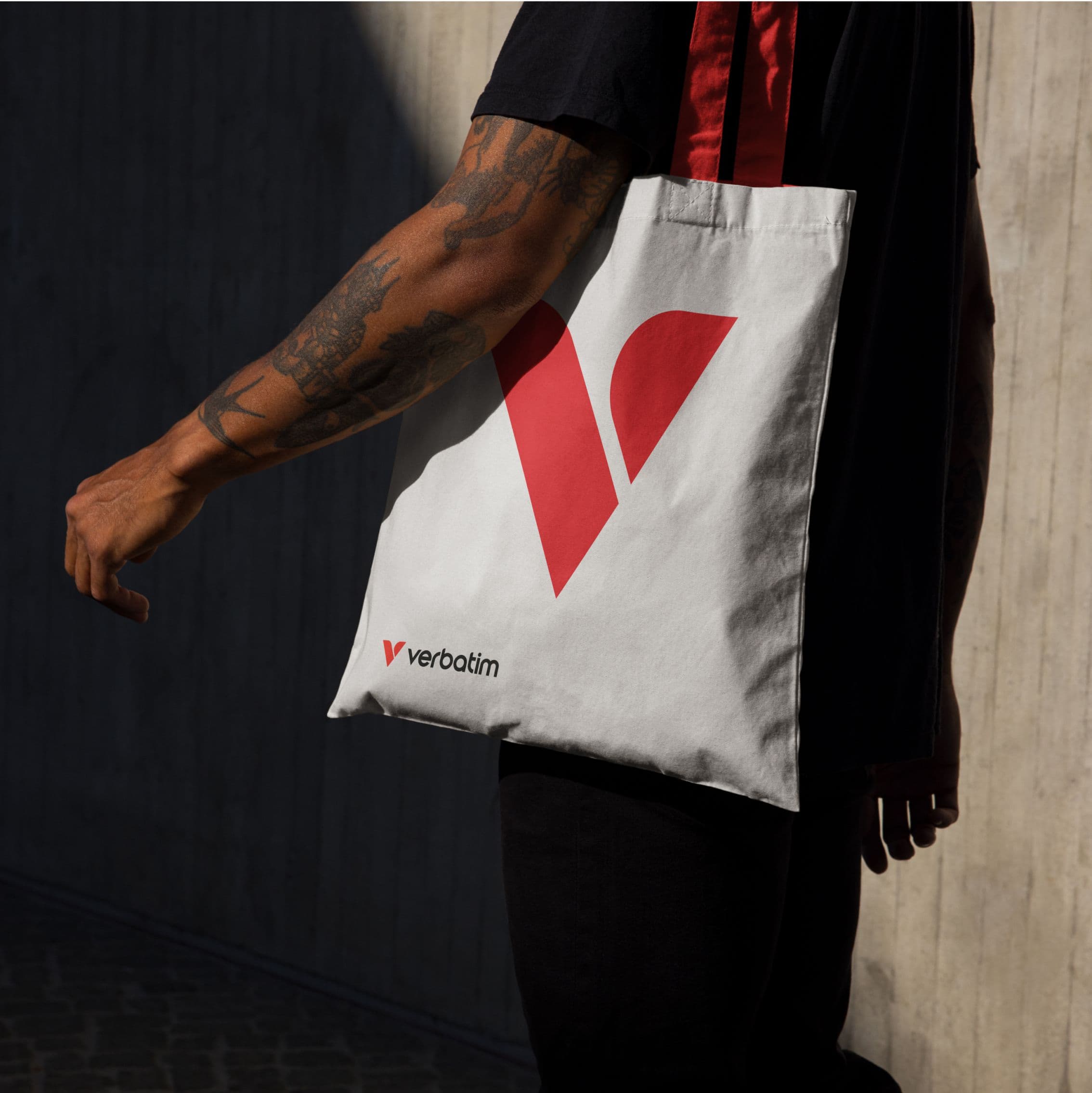
From floppy disks to mobile accessories, Verbatim needed a bold new brand to connect with a new hyper-mobile generation. Meeting all their needs, wherever they are, whatever they’re doing.

Verbatim helped define the digital age, pioneering floppy disks, optical media and data storage that powered early digital lives. But while their products evolved, their brand didn’t.

Once a household name, they were losing ground with a younger, always-on generation. Their tech was ready. Their story wasn’t. With a growing portfolio spanning peripherals, accessories and gaming, Verbatim needed to connect with a faster, freer audience who didn’t know their name, but needed what they made.

We helped them reposition, reimagine and relaunch. A full strategic and creative reboot, from brand strategy to packaging, motion to messaging, digital to physical touchpoints. A brand built for now.

Gold
Winner at Transform Awards 2025

for Best Brand Development Project to Reflect a Change of Mission, Values, or Positioning (Consumer).

Gold
Winner at Transform Awards 2025

for Best Visual Identity from the Engineering and Manufacturing Sector.

1
Global brand

Consolidated global brand to work across multiple territorries.

We transformed Verbatim from utility-driven to emotionally resonant, built around the idea of movement, connection and everyday relevance.

The new “Anywhere. Everyday.” proposition captures their real-world role. And a distinctive Verbatim Coral cuts through the category clutter.

At the heart of the rebrand sits the new logo — the Vision symbol, a forward-looking “V” inspired by motion and perspective.

More than a logo, it’s a lens for the brand. It becomes a recognisable mark across packaging, platforms and products. A design cue with cut-through. A symbol that gives Verbatim an edge. It makes them more memorable, more human, and more relevant than ever.

Hands on. All in.

This was global. And complex. Each Verbatim region has its own marketing team, priorities and view of the brand.

We put in the work – listening, aligning, engaging. All to develop a unifying proposition that every region could rally behind. It wasn’t always easy, but it was worth it.

Together, we created a brand everyone believed in. From Japan to Germany to the US, the internal adoption was instant. The new identity made noise externally, while also building real internal pride. That’s what happens when every team sees itself in the story. Everyone is in.

We win awards. For our clients.

We get great work over the line. Every time. At the 2025 Transform Awards, Verbatim’s rebrand swept the board with five wins:

  • Gold in Best Brand Development Project to Reflect a Change of Mission, Values, or Positioning (Consumer)
  • Gold in Best Visual Identity from the Engineering and Manufacturing Sector
  • Silver in Best Digital Transformation
  • Bronze in Best Brand Evolution (Consumer)
  • Highly Commended in Best Use of a Visual Property

We won these for Verbatim. Amplifying their reputation. Sharpening their edge.

No fluff. Real results.

Launched at COMPUTEX, Taiwan, the rebrand re-established Verbatim as a serious player in a crowded, commoditised space. Clearer differentiation. Stronger emotional resonance. Positive feedback from global teams and customers. Product and packaging strategies, realigned. Brand value, delivered.

We can’t thank the team at Dusted enough for their exceptional work in bringing to life our new identity, tagline, packaging, website, supporting graphics, and launch video. They understood exactly what we needed, and their creativity and professionalism were outstanding, delivering everything in an impressively quick timeframe that allowed us to unveil our new look at Computex. We couldn’t have asked for a better partner in this endeavour.

Jonathan Colbourne
Marketing Communications Manager at Verbatim Europe

Related projects

Cubic³

Shifting perceptions. Defining the future.

dormakaba

Creating a brand for every place that matters.

Orgvue

Defining the future of workforce intelligence.

dormakaba

Campaigns to access all areas.

Text graphic promoting a platform for innovation with layered colors.
Geometric shapes in neon green on a dark background.
3-in-1 wireless charging stand for Apple Watch and iPhone.
Black electric SUV with illuminated features against a gradient background.
Stylized letters 'AI' against a blue background with waves.
Smiling man in a blazer with glasses against a colorful background.
Abstract design with red lines on a black background and text.
Close-up of vibrant blue flowers with yellow stamens.
Abstract logo featuring white and red geometric shapes.
Person holding a white tote bag with a red Verbatim logo.

[Contact us]

Let’s build your brand edge.

Schedule a discovery call with our award-winning team to see how we can transform your brand vision into reality.

Get in touch