Good design is creative design. In the world of digital products, however, even better design is consistent design.
UI expands beyond aesthetics. It can make or break a brand, with a product’s design informing 75% of brand credibility judgements. Considering that people are now more likely to encounter your brand virtually rather than physically, high-quality interfaces are crucial.
And consistency plays a major role. Here’s why.
Why is consistency important?
Any UI designer will tell you that consistency is simply what should be expected.
Ideally, it would be the baseline for every user interface. But from Amazon’s haphazard navigation to Yahoo’s ad-ridden content layout, this isn’t always the case. Navigating such websites can lead to frustration with your platform and, ultimately, your brand.
Organisational considerations
Design is notoriously hard to scale. For non-designers, this can be easy to forget. After all, the best designs make us forget that behind all the creativity hides real science.
You might already have a well-functioning digital platform. Without a system in place, however, it can easily crumble, eroded by every new component. This usually creeps up on organisations. Used to seeing their platforms daily, they become blind to the inconsistencies that accumulate over time: today it’s one out-of-place heading, tomorrow it’s a left-aligned CTA where it used to be centred.
For you, this might not mean much. But your audience will struggle, which leads us to the user considerations.
User considerations
Each different button style, colour scheme or navigation pattern requires additional mental effort to understand. Without predictable patterns, users can’t rely on their previous experiences to guide interactions. Inconsistency disrupts a seamless flow.
The consequences might be as benign as a visitor taking longer than needed to complete a desired action. But in severe cases, it can also mean a missed opportunity due to potential customers not understanding your product or service offering.
Impact
If you struggle with high bounce rates, frequent user errors or low conversion, it might mean it’s time to revamp your platform’s UI.
But, if you’re reading this article, you already know this. You’re diligently doing your research, scoping out what such a change actually means.
Yes, right now it seems monumental. The good news is that it’s not all doom and gloom. With a strategic approach, you can achieve a consistent interface that enhances the user experience across all your platforms.
In this article, we’ll discuss the benefits of design consistency alongside our best practice advice. Read until the end for a real-world case study.
But first, let’s clear the waters… What do we mean by consistent UI?
What is consistent UI?
Consistent UI is the practice of maintaining uniformity in design elements and interactions across all parts of a digital product. From a cohesive visual style to a predictable functionality, they all need to adhere to a standard.
Enter design systems.
What are design systems?
A design system is a comprehensive set of guidelines that dictate the visual and functional aspects of your digital product. It encompasses everything from colour palettes and typography to interaction patterns and accessibility standards. By providing a unified set of rules, a design system ensures every type of consistency is maintained throughout all the platforms and channels under a brand.
Types of consistencies
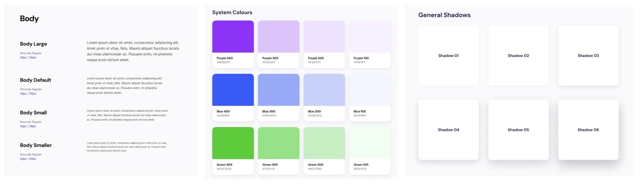
Colours and fonts. You already know that these should be consistent. But stay with us for a second, because it runs deeper than this. Below are all the types of consistencies your design system needs to define and document.
Type Definition Components Benefit Visual Cohesive and predictable visual appearance.
- Colour palette: Define primary, secondary, and tertiary colours, including usage guidelines for each.
- Typography: Specify font families, sizes, weights, and spacing for headings, body text, and other typographic elements.
- Spacing and layout: Establish rules for margins, padding, and grid systems.
- Iconography: Develop a consistent style for icons, including size, colour, and line weight.
- Imagery: Guidelines for photos, illustrations, and other graphics, including style, tone, and treatment.
- Animations: Consistent animation styles and transitions, including speed, easing, and triggers.
Creates a strong, unified brand identity that enhances brand recognition and professionalism. Functional Similar actions lead to similar results.
- Predictable actions: Outline standard interactions and responses, like hover effects, button clicks, and form submissions.
- UI components: Develop a library of components like buttons, forms, filters, and modals with consistent behaviour and styling across the application.
- Error handling: Standardised approach to error messages and feedback, ensuring users understand issues and how to resolve them.
- Loading indicators: Consistent use of loading animations or progress indicators to manage user expectations.
Enhances user confidence and satisfaction by providing a reliable and predictable experience. Internal Uniformity across different platforms and devices.
- Similar look and behaviour: Ensure that design and functionality are consistently optimised across browsers and devices.
- Responsive design: Use fluid grids, flexible images, and media queries to ensure the UI adapts to different screen sizes and orientations.
- Accessibility: Maintain consistent accessibility standards, ensuring that all users, including those with disabilities, have a good experience.
Reduces learning curve and improves user experience across different devices, enhancing overall usability. External Aligning design across different products within a brand.
- Interaction patterns: Standardise common user interactions and navigation patterns to make transitions between products intuitive for users.
- Cohesive and integrated UX: Develop shared components and design guidelines that ensure a seamless user experience across all products within the brand.
- Brand voice and tone: Maintain a consistent voice and tone in all written content across products to reinforce brand identity.
Strengthens brand identity and makes it easier for users to transition smoothly between different products.
How to achieve a consistent UI using design systems
If you’ve made it this far, you’ll be happy to know you’ve reached the fun part – the part where theory translates into action. We’ll not only tell you how to achieve a consistent UI, but we’ll also show you how we do it for our clients.
Design systems best practice for consistent UI
Developing design systems might seem like a big task to tackle. And we won’t beat around the bush: it can be daunting. There are many aspects to keep track of when making design decisions for an entire website and beyond.
Luckily, we’ve done it many times over and we’re here to share everything we put into practice in all our projects. Without further ado, here are the steps to creating an efficient design system that ensures a consistent user experience across your touchpoints.
Define user goals
Understanding and defining user objectives is the foundation of your design system. This step cannot be underestimated. To define your goals, you must gather insights about your target audience’s needs and preferences through surveys, interviews, and usability testing.
Our tips:
- Engage directly with users: Uncover pain points, desires, and behaviours through direct engagement. This can be through interviews, focus groups or workshops.
- Leverage quantitative methods: Implement A/B testing and heat mapping to complement these qualitative insights. We use Hotjar to gather all this data and we highly recommend it.
- Use mixed methods: Combine qualitative and quantitative data for a robust understanding of user needs.
Recurring patterns
Next, analyse the data collected to identify common themes and patterns. This informs your user personas and user journey maps, which serve as reference points throughout the design process. It’s essential to involve stakeholders in this phase to ensure that the insights align with business objectives.
Our tips:
- Adopt a feedback loop: Nothing is set in stone at this point. Regularly update and refine user objectives based on ongoing feedback and testing.
- Iterative approach: Use an iterative design process to stay adaptive to changing user needs and market trends.
Create a unified design language
To ensure all team members are on the same page, establish a unified design language that will be used across all digital products. This includes keeping track of all the elements discussed in the table above. Document these clearly and provide examples of correct and incorrect usage.
Our tips:
- Define core elements: Specify primary and secondary colours, font families, and sizes, spacing guidelines, and common UI components.
- Create a style guide: Develop a comprehensive style guide that includes examples and rules for using each element.
- Regular updates: Keep the design language up-to-date to reflect any changes or new trends.
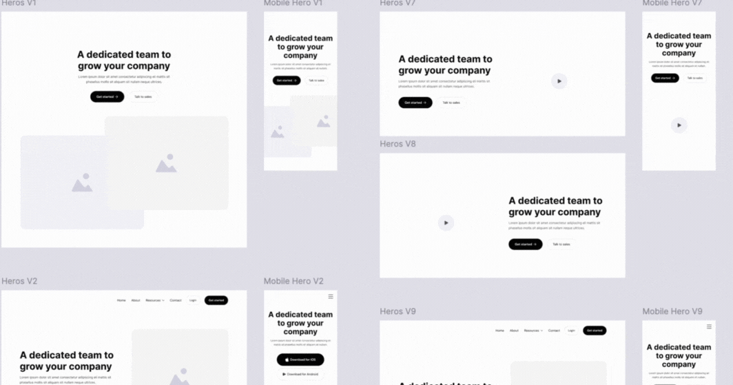
Develop reusable components
Reusable components are fundamental to a design system. Things like buttons, form fields, and navigation bars should be adaptable to various contexts while maintaining a consistent look and feel. Nailing this will make your product scaleable in the long run.
Our tips:
- Component library: Create a library of reusable components with detailed documentation on how to implement them.
- Standardise naming conventions: Use consistent naming conventions for components to avoid confusion.
- Version control: Implement version control to manage updates and changes to components.
Establish design tokens
Design tokens are the smallest pieces of a design system, representing design decisions like colours, typography, and spacing in a technology-agnostic way. They ensure consistency and scalability across different platforms and devices.
Our tips:
- Identify key tokens: Define design tokens for colours, fonts, spacing, and other visual properties.
- Implement across platforms: Use these tokens in your codebase to ensure consistency across web, mobile, and other digital products.
- Automate synchronisation: Use tools to automate the synchronisation of design tokens across different environments.
Utilise automated testing
Automated testing can help ensure that your design system remains consistent as it evolves. Implement testing frameworks that can verify the visual and functional aspects of your UI components.
Our tips:
- Visual regression testing: Use tools like Percy or Chromatic to detect visual changes in your components.
- Unit and integration testing: Implement unit and integration tests for your components using frameworks like Jest and React Testing Library.
- Continuous integration: Use these tests in your continuous integration pipeline to catch issues early.
Encourage ongoing improvement
Design systems are living documents that need continuous improvement. Encourage your team to provide feedback and suggest enhancements regularly.
Our tips:
- Feedback channels: Set up channels for team members to provide feedback, such as regular meetings, surveys, or an online forum.
- Iterative updates: Plan for regular updates and reviews of the design system to incorporate feedback and stay current with design trends.
Case study: A consistent UI for the highest accessibility standards
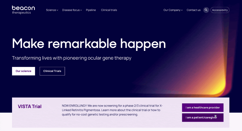
Our client Beacon Therapeutics is a leader in ophthalmic gene therapy developing a cure for blindness. Recently, they secured $170 million in Series B funding — a significant milestone greatly supported by our repositioning and brand-driven digital campaigns.
They came to us with a challenge: their website needed to cater to diverse audiences, including healthcare practitioners, investors, and patients considering clinical trials. It had to be both appealing and functionally robust, capable of addressing the varying needs of these groups.
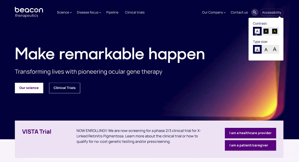
With a big portion of their audience being visually impaired individuals, we had to adhere to the highest accessibility standards. So, we implemented light and dark modes as well as a high-contrast colour scheme and customisable font sizes to cater to users with varying visual needs. Interactive elements were designed with keyboard navigation in mind, ensuring an inclusive experience for users with different abilities. These features extended beyond conventional design considerations, balancing functional and accessibility needs with brand identity.
To maintain consistency across all these varying elements, we established a unified design language. This involved defining core elements such as primary and secondary colours, font families, sizes, and spacing guidelines, all documented in a comprehensive style guide with examples and rules for correct usage.
We then developed a library of reusable components, including buttons, forms, and navigation elements, with detailed documentation for implementation. Standardising naming conventions helped avoid confusion. This approach ensures that all parts of the website maintain a cohesive look and feel, even across the accessibility variants.
Most importantly, these design system settings are already set up in the CMS, so site editors don’t need to apply them manually. This includes features like automatic button coloring based on background brightness and fluid font sizing based on the user’s screen size.
Ultimately, we created a website that successfully merged functionality with accessibility. Maintaining consistency was crucial. It ensured that accessibility features were uniformly applied, allowing all users to navigate and interact with the site.
To read more about our work for Beacon, read the full case study here.
Future trends in UI design
Design systems are nothing new. If you were around working in UI at the tail-end of the 2010s, then you’ll remember the craze around them. They were all the rage, with Figma’s Design Systems gaining a bit of a cult following at the time. This doesn’t mean, however, that design systems are old news. If anything, they are now so ingrained in UI best practice that they have become essential tools for modern workflows.
Even so, with emerging technologies, the future of design systems is as exciting as it is volatile. Here are some key trends to watch:
- Increasing expectations for micro-interactions: Micro-interactions are gaining more attention. These include animations for likes, button clicks, and other subtle feedback mechanisms that make interactions more engaging. In 2024, the emphasis on these tiny details is expected to increase, turning good user experiences into great ones.
- Typography takes centre stage: Typography is increasingly seen as a crucial element of brand and design expression. Designers are now creating custom typefaces to reinforce brand identity and enhance visual storytelling. Advanced methods, including kinetic typography and variable fonts, are now allowing for dynamic adjustments to suit diverse environments.
- Green design is getting the green light: According to Fuselab, sustainability is becoming a significant focus in design systems. This involves using eco-friendly colour schemes, optimising a website’s carbon footprint, and integrating features that encourage eco-conscious behaviour. Sustainable design not only aligns with environmental values but also creates a positive user perception, appealing to the growing number of eco-conscious consumers. Check out our article exploring the rising awareness of ESG and its importance in branding for more information.
- Global design system: There’s now an ongoing discussion around the feasibility of one design system to rule them all. Currently, every organisation has a design system of their own and often there is significant overlap between them, particularly from a functional perspective. What if there was a single system that contained every common component that is in use today? This is the thinking behind Brad Frost’s plan for a Global Design System. His belief — “A Global Design System would improve the quality and accessibility of the world’s web experiences, save the world’s web designers and developers millions of hours, and make better use of our collective human potential.”
By embracing Design Systems, you can enhance your designs to not only meet the expectations of modern audiences but also take them by surprise…
…and if you want to keep a pulse on other future trends in digital, marketing and brand, consider subscribing to our monthly newsletter via the big yellow subscription box on the right.
In conclusion
Beyond shaping the look and feel of digital products, UI consistency also enhances usability and reinforces brand credibility. By implementing unified standards under design systems, organisations can ensure their digital interfaces are both intuitive and inclusive. If your digital platforms fail to meet users’ expectations, you risk frustrating your audience. And especially in oversaturated industries with cutthroat competition, this means missed opportunities.
Not sure where to start?
As a brand design agency, at Dusted, we deliver strategic solutions for ambitious clients across a range of B2B and B2C sectors. Whether it’s a fresh pair of eyes on your UI or a much-needed website revamp, we will assess your business’s unique needs in designing an inherently consistent platform that works for you.
So get in touch now to book a consultation, we can’t wait to hear from you!