
Wondering why your brand colours look different in print vs on screen? This guide explains colour modes, the difference between RGB and CMYK, why it matters for colour reproduction, and how to keep colour consistency across design and print.
When our clients see their freshly printed print products for the first time, the question often comes up: “Why do they look different to what I saw on screen?”
It’s a fair spot. And they’re right – the colours don’t always match perfectly. But so are we. The difference isn’t a mistake, it’s the result of how each colour system works. Which brings us to RGB vs CMYK.
What are the different colour spaces? RGB vs CMYK explained
You might have come across the terms CMYK and RGB before. If not, here’s a quick breakdown:
- CMYK stands for cyan, magenta, yellow and key (black). It’s the standard printing process used for most printing methods. Each layer of ink subtracts wavelengths from white paper and reflects others – a process called subtractive mixing. Black is added separately (known as “key”) to give depth, detail and rich black.
- RGB, on the other hand, stands for red, green and blue – the three primary colour types of light. This colour mode is used for screens, from monitors to cameras to phones. Here, colours are created by light being added together – an additive mixing process. At full intensity, red, green and blue combine into white. With no light at all, you get black.
For anyone working with digital images, understanding these two colour modes is essential. It helps ensure your colour accuracy, avoids surprises in colour conversion between screen and print, and gives you control over your file formats and outputs.
Why do colours look different in print vs screen?
In print, colours are layered from cyan, magenta and yellow inks. But these inks alone aren’t strong enough to create deep, opaque colours – which is why black is added as a fourth layer in the CMYK colour system.
Screens are different. They generate colour by shining the RGB colour spectrum of light directly at your eyes. Print relies on reflecting parts of the colour spectrum off a surface. Paper texture, finish and the inks themselves all influence how the spectrums of light are perceived.
Here’s the simple version:
- RGB is how colour lives on digital devices.
- CMYK is how colour lives on paper.
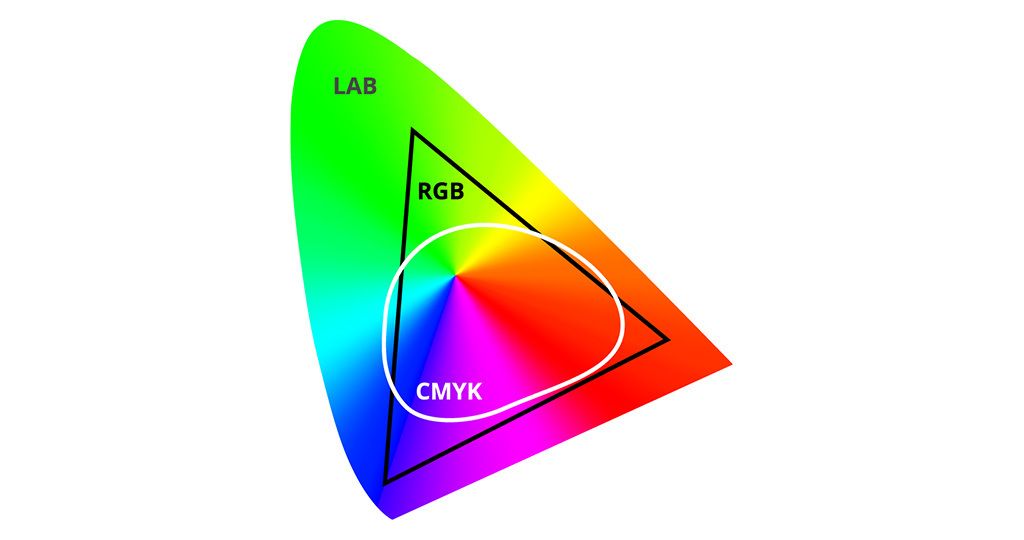
And because they create colour in different ways, the results vary. RGB offers over 16 million shades in its colour gamut, while CMYK delivers around 16,000. That’s why bright, saturated RGB tones can look flatter once printed.
Even when you’re viewing a CMYK proof as a PDF file, your monitor is still RGB-based. It’s translating ink colours into light colours as best it can. Which means what you see in digital work isn’t always a perfect preview of the printed result.
And before you ask…
At Dusted, we build brands for a digital-first world, so our digital work starts in RGB. But when it comes to design systems and brand guidelines, we always define CMYK and Pantone equivalents too. That way, your colour palette is ready for every channel – and we make sure the CMYK recipe gets as close as possible to the vibrancy of the RGB version.
For more information, check out our brand identity services.
Digital design, colour matching, and keeping your colours consistent
RGB vs CMYK is only part of the story. The bigger picture is colour management – keeping your brand colours aligned across digital devices, printers and platforms.
Every device interprets colour differently. Your laptop, phone, scanner, printer or paper stock – each has its own “profile” that defines how it shows or prints colour. That’s why a brand colour can look slightly different across digital images, print products or different printing methods.
To keep everything aligned, designers use image editing tools, standardised colour modes like sRGB or Adobe RGB, and calibration processes to ensure accurate colour reproduction.
LAB: a universal reference point
Thankfully, there’s a universal colour system that sits above device-specific profiles: LAB.
- L = lightness
- A = red–green axis
- B = yellow–blue axis

Because LAB is device-independent, it acts as a translator. Designers use LAB to convert colours from one device profile to another, maintaining colour accuracy across formats.
Formula: LAB + device profile = accurate colour match.
This workflow helps ensure brands look consistent – from digital work to brochures to large-scale print products.
International standards
Consistency also depends on global standards. The Pantone Matching System (PMS) is the most widely used. Pantone gives every shade a unique reference, ensuring reliable colour reproduction across print providers, regions and materials. For many brands, Pantone is the ultimate benchmark for colour consistency.
Why RGB and CMYK cause colour shifts
The gap between RGB and CMYK is one of the main reasons for visible shifts. RGB can display millions of shades on digital devices, while CMYK works within a smaller colour gamut based on inks and printing methods. Add in device-specific differences, and the challenge of maintaining colour consistency becomes clear.
That’s why professional print providers and designers focus on colour management. With the right tools, file formats and standards, you can achieve strong colour accuracy across all outputs.
Work with us
Colour is complex. But with the right expertise, it’s manageable. At Dusted, we create brands that stand out and stay consistent – on screen, in print, and everywhere in between.
As a brand design agency, we’ve delivered for some of the world’s leading names in tech, finance and professional services. And we can do it for you. Reach out now.
FAQs
Why do my brand colours look different in print compared to on screen?
Because screens and print use different colour modes. RGB uses light – luminous and vibrant. CMYK uses ink – subtractive and physical. Each printing process has its own colour gamut, so shades that glow on screen can look duller in print.
Which colour space should I use for my brand?
Both. RGB for digital work – websites, apps, presentations. CMYK for print products – brochures, packaging, business cards. Strong guidelines define exact values across colour types.
Can CMYK ever match RGB exactly?
Not always. The RGB colour spectrum is far wider. Some saturated tones simply can’t be recreated with ink. Designers choose the closest CMYK equivalent for reliable colour reproduction.
Why does a PDF proof look different on my screen?
Because your monitor is still using RGB. A PDF file with CMYK data gets converted for screen viewing, which creates slight differences. Calibration across digital devices helps.
What is LAB and why does it matter?
LAB is a universal colour system used to ensure colour accuracy. It translates colours between device-specific profiles, keeping brand colours true across digital images and print products.
How can I keep colours consistent across different media?
- Use brand guidelines with RGB, CMYK and Pantone references.
- Calibrate digital devices regularly.
- Export in the right file formats.
- Work with expert print providers who understand colour management.
What’s Pantone and do I need it?
Pantone is a global colour system. It standardises colours for consistent colour reproduction, making it essential when colour accuracy is critical – especially in logos.
Do Dusted take care of this in branding projects?
Yes. We start in RGB for digital work, then define CMYK and Pantone equivalents. That way, your colour palette is prepared for every platform, ensuring colour consistency across screen and print.